Introduction
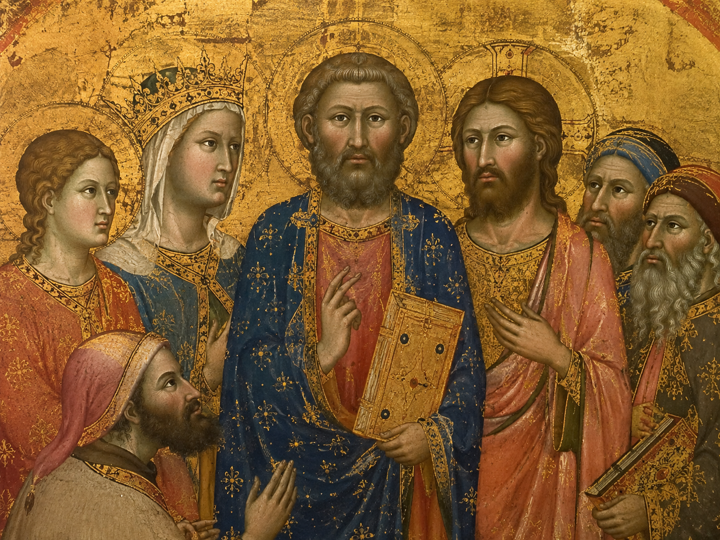
Look at a medieval painting for a few seconds and something may bother you.
The faces can seem oddly flat. The hands may look too large. Bodies can feel stiff. People stare straight ahead with wide, serious eyes. Someone who should be standing behind another person may appear almost the same size.
And then there is the question that usually follows:
Why didn't the artist just make them look like real people?
It is a fair question.
After all, medieval artists could work with remarkable care. They painted tiny letters, fine patterns, hair, jewels, folds in clothing and even small details in books and buildings. Some surviving manuscripts show very close attention to faces, clothing and objects.
So the strange faces were not simply the result of artists being unable to draw.
The bigger problem is that we are looking at these paintings with a modern idea of what a picture is supposed to do.
Today, we often expect a painting to show us a believable person in a believable space.
Many medieval artists had a different job.
A painting could tell a religious story, show who mattered most, help someone pray, or make a holy figure immediately recognizable. Looking exactly like a person standing in front of you was only one possible goal.
Once you notice that, those strange faces start to make a little more sense.
Chapter 1 — Were Medieval Artists Actually Bad at Drawing People?
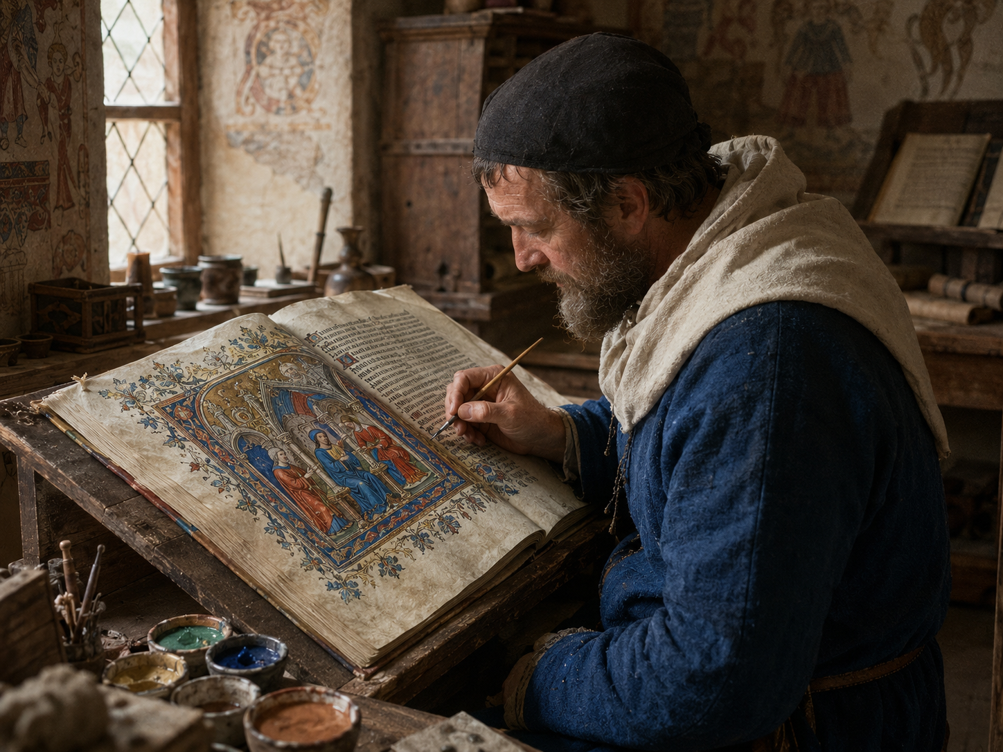
Start with the face.
The eyes may look too large. The nose may be unusually long. The mouth may be small and still. The head may seem oddly shaped.
It is tempting to look at it and think:
The artist simply did not know how to draw a face.
But then look at something else in the same work.
A border may contain tiny leaves.
A piece of clothing may have carefully painted folds.
Jewellery may be picked out in fine detail.
A manuscript artist might even give different people different hair, beards, clothing and expressions. The Metropolitan Museum's collection includes Byzantine and medieval manuscripts where artists paid close attention to furnishings, writing tools, drapery and other small details.
So the problem was not always lack of skill.
Sometimes the artist knew how to make something look natural and simply chose not to do it that way.
That distinction matters.
Medieval art covers a very long period and many different places, so there was no single medieval style. Some works are highly stylized. Others move toward greater naturalism. Some artists were very interested in believable bodies and movement. Others cared more about clear symbols and recognizable figures. The amount of naturalism changes greatly across time and place.
So when we say a medieval painting “looks strange,” we are often seeing a choice of visual language rather than an inability to draw.
The artist was making a picture.
And a picture did not have to behave like a photograph.
Was It Really Bad Drawing?
Chapter 2 — A Face Did Not Have to Be a Portrait
Here is where our modern eyes can get confused.
When we see a face in a painting, we tend to ask:
What did this person really look like?
A medieval viewer could ask a different question:
Who is this person?
That changes everything.
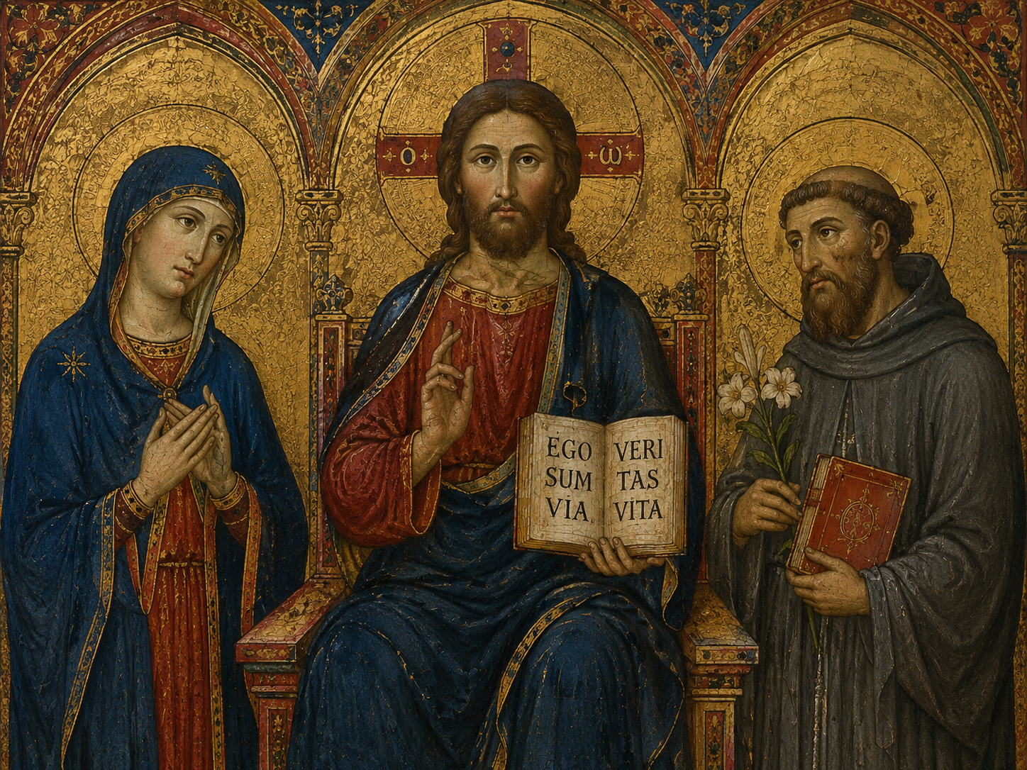
A saint might be shown with a familiar attribute. A king could be identified by his crown and clothing. A holy figure might appear with a halo. Clothing, hair, posture and other visual clues could tell the viewer what kind of person they were looking at.
The Metropolitan Museum notes that medieval artists could use clothing, hair, pose and other features to communicate identity rather than simply aiming for naturalistic appearance.
So the face was not always meant to be a private portrait.
It was part of a message.
A viewer who already knew the story did not necessarily need ten subtle facial expressions.
They needed to know:
That is Christ.
That is Mary.
That is a saint.
That is the king.
The clearer those identities were, the easier the image was to understand.
This is one reason repeated styles can appear across religious art. An image did not have to look like a different photograph of the same person. It could follow an established visual tradition so that viewers recognized the subject quickly.
In that sense, a medieval painting could work a little like a sign.
You see it.
You know what it means.
The goal was not always to make you wonder whether the face looked real.
The goal was often to make sure you knew who you were looking at.
How a Medieval Viewer Read a Figure
Chapter 3 — Why Is Everyone Standing So Stiff?
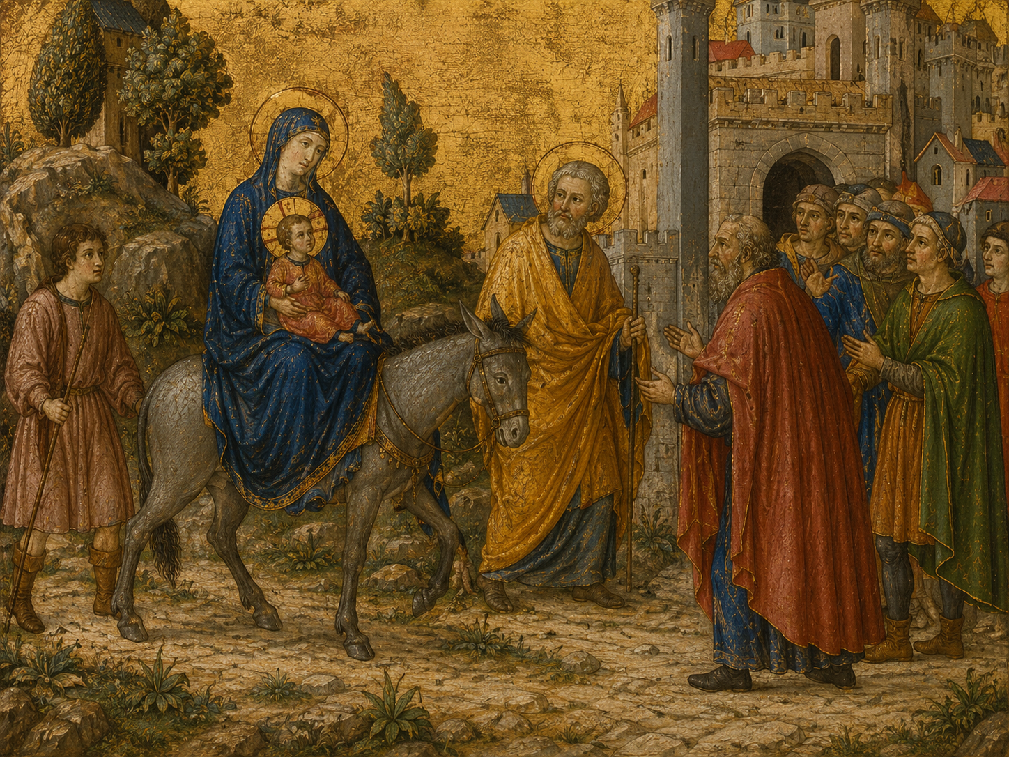
Now look at the bodies.
They can seem frozen.
A person stands almost straight up. Another raises an arm but does not seem to move naturally. Faces may turn only slightly. There is often very little of the relaxed body language we expect from modern paintings and photographs.
Again, this can look like a lack of skill.
But a stiff body can also be useful.
Think about trying to explain a scene clearly to someone who has never seen it before.
You want to make each figure easy to recognize.
You do not want one person hidden behind another. You want to see the important object being held. You want the viewer to understand who is blessing, who is listening, who is praying and who is attacking.
A calm, clear pose can help.
Medieval art did become more interested in movement and natural-looking bodies at different points. A North French work from around 1175–1200, for example, is described by the Metropolitan Museum as showing emerging Gothic interest in naturalism, fluid drapery and lively narrative.
That tells us something important.
The change was happening gradually.
Artists were not suddenly discovering that people had elbows.
They already knew.
What changed was how much natural movement, anatomy and space they wanted to show.
And once you notice that, a stiff-looking figure becomes less mysterious.
The pose may be doing a job.
It keeps the scene clear.
Why the Poses Look Stiff
Chapter 4 — Why Is the Important Person Sometimes Much Bigger?
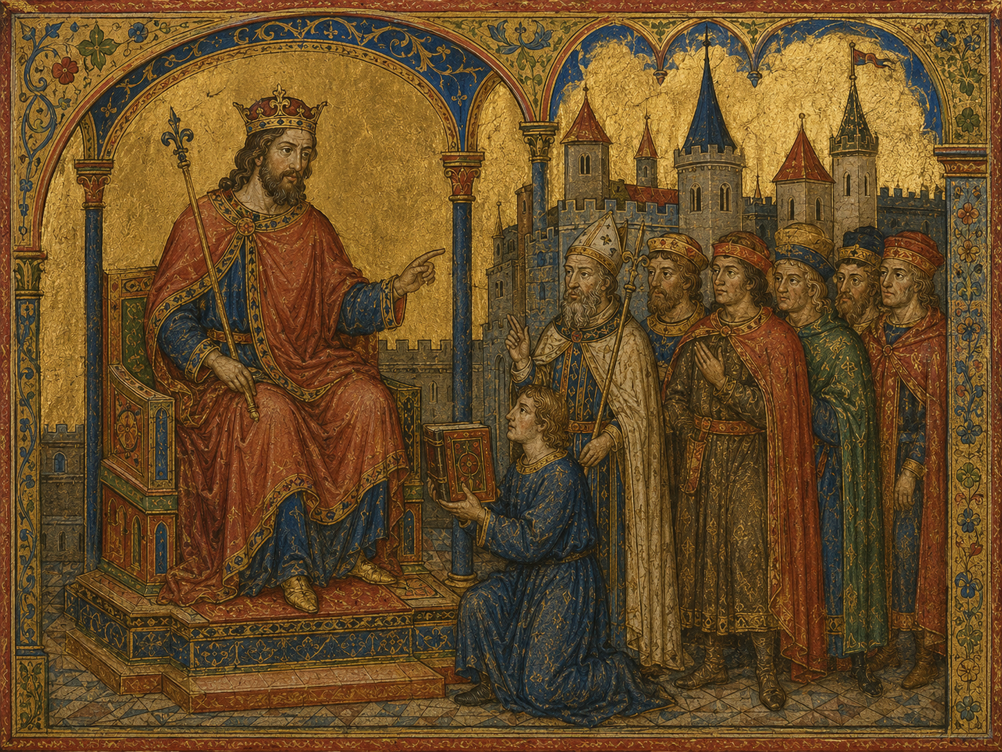
Now comes one of the strangest things.
Look at some medieval scenes and you may notice that people do not appear in their real sizes.
A king might be larger than the people around him.
Christ might tower over other figures.
A servant may be much smaller even though the two people are standing in the same scene.
That is not a mistake in the ordinary sense.
It can be a way of showing importance.
Art historians call this hieratic scale: figures can be shown larger or smaller according to their importance rather than their actual height.
Imagine you are looking at a scene of a ruler with attendants.
If everyone were exactly the same size, you would have to rely on clothing, crowns or other details to see who mattered most.
Make the ruler larger, however, and you understand immediately.
The bigger figure matters more.
The picture is making an argument without using words.
This is another reason some medieval paintings can feel “wrong” to modern eyes.
We expect a painting to obey the rules of the physical world.
Medieval artists could break those rules to obey a different one:
Make the meaning clear.
That does not mean every large figure in medieval art was meant to show social importance, and not every work uses this system. But where it appears, the unusual size is deliberate rather than simply an artist misunderstanding human proportions.
Once you know what to look for, the strange proportions stop looking random.
They start talking to you.
When Size Means Importance
Chapter 5 — The Gold Background Was Not Trying to Be a Room
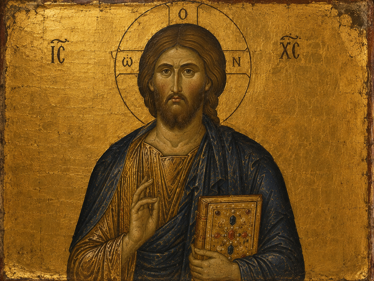
There is another feature that can make medieval paintings look strange to us.
The background.
A modern painting may place people inside a room, a landscape or a carefully drawn street.
Medieval religious images often give you something else.
Gold.
A shining gold background can make a figure seem to float somewhere outside the ordinary world.
At first glance, it may look like the artist simply did not know how to paint a proper background.
But that misses the point.
In Byzantine art, gold grounds were closely tied to the way holy images were presented. The Metropolitan Museum, for example, notes that the shimmering gold surface of Byzantine icons recalled the appearance of images in church interiors.
The gold was not trying to look like a wall.
It was doing something else.
It separated the holy figure from ordinary surroundings.
There is no need to ask:
“What room is Christ standing in?”
The image may not be asking you to imagine a room at all.
The figure is simply there, presented before you.
This is another place where modern expectations can get in the way.
We want to know where the person is standing.
The medieval artist may be more interested in who the person is and what the person represents.
And that changes the whole picture.
The strange background is not missing information.
It is part of the message.
What Does the Gold Background Mean?
Chapter 6 — Look at the Details. They Give the Game Away
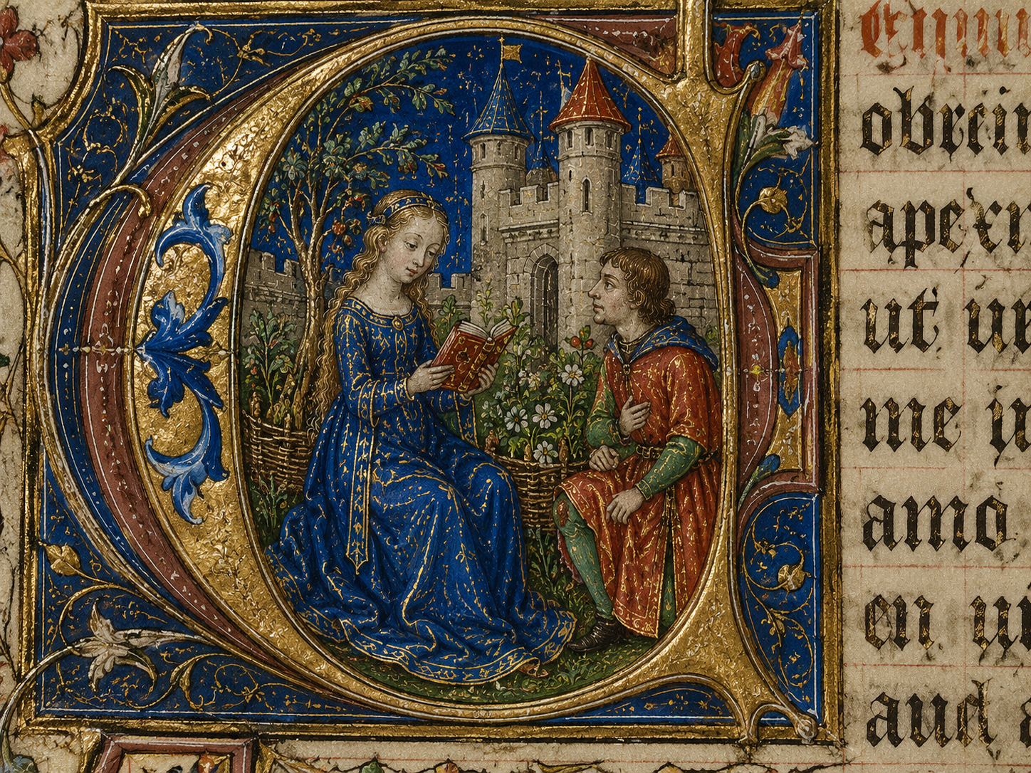
Now look closely at a medieval manuscript.
The people may still look unusual.
But the rest of the picture can be astonishing.
A robe has tiny folds.
A table has objects placed carefully on it.
A building has windows and doors.
A horse has recognizable equipment.
A page may contain plants, animals, tools and pieces of furniture painted with surprising care.
The Getty has described medieval manuscript artists who paid close attention to individualized facial features, drapery, landscapes and other details.
The Metropolitan Museum's Byzantine manuscript of Saint Luke is another useful example. The artist carefully showed Luke's writing tools, an inkwell, a knife for sharpening quills, a book and the details of his clothing and surroundings.
This creates an interesting question.
If an artist could paint a quill knife accurately, why make a face look so unusual?
Because different parts of the same image could have different jobs.
One part tells you who someone is.
Another gives you a story.
Another creates beauty.
Another helps you recognize an object.
And another reminds you that what you are seeing is sacred.
The artist was not necessarily trying to make every part equally realistic.
That is why it can be misleading to judge a medieval painting by asking only:
“Does this look exactly like real life?”
A better question is:
“What did the artist want me to notice?”
Once you ask that, the painting becomes much easier to read.
Different Details, Different Jobs
Chapter 7 — Then the People in the Paintings Started to Move
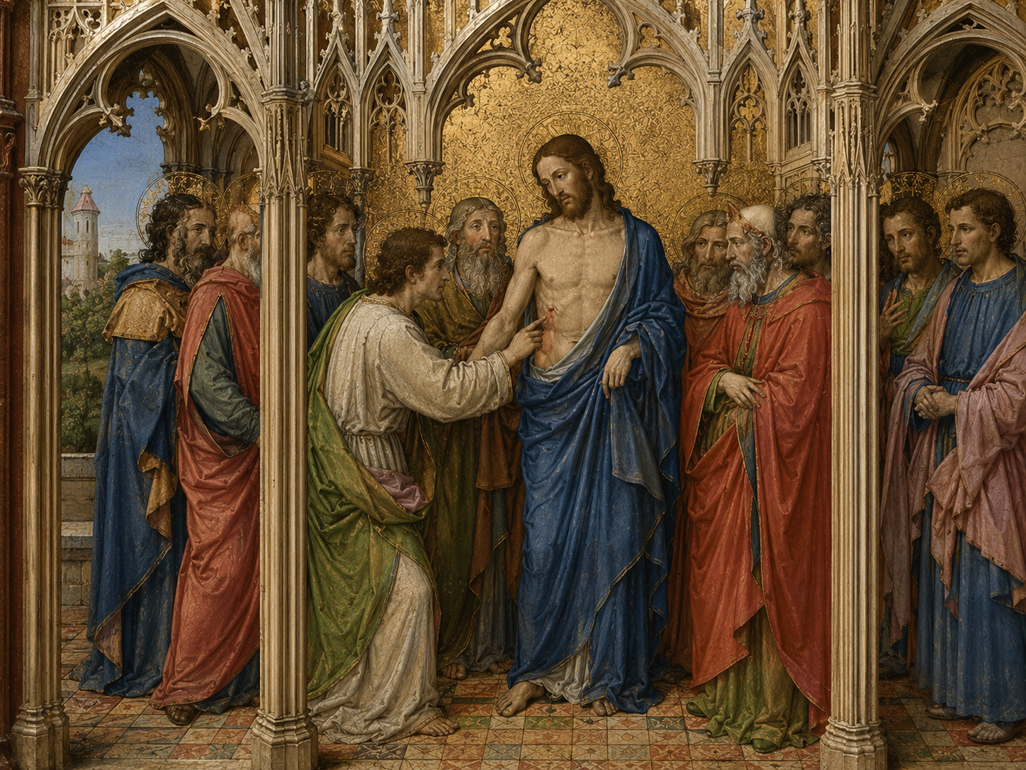
And then something changes.
Figures begin to look less stiff.
Bodies gain weight.
Clothing begins to follow the shape of the body.
Faces become more varied.
People turn toward one another instead of simply facing the viewer.
The change was not sudden.
During the Gothic period, artists increasingly explored naturalism. The Metropolitan Museum describes works from the late 12th century as showing an emerging interest in natural forms, fluid drapery and lively storytelling.
Over the following centuries, Western European artists pushed these ideas further.
They became more interested in the body as a physical thing.
How does a person stand?
How does cloth fall?
How does a face change when someone looks down?
How do several people occupy the same space?
These questions gradually became more important.
So when you place an early medieval painting beside a later Gothic one, the difference can be striking.
The later figures may feel more alive.
They may look as though they could step out of the picture.
But it is worth remembering something.
The earlier artists had not failed to discover reality.
They had been working with different priorities.
Later artists simply gave natural appearance a larger role.
That is why the change feels less like a switch being turned on and more like a road slowly changing direction.
From Stylized to More Natural
Chapter 8 — So Why Does Renaissance Art Look So Different?
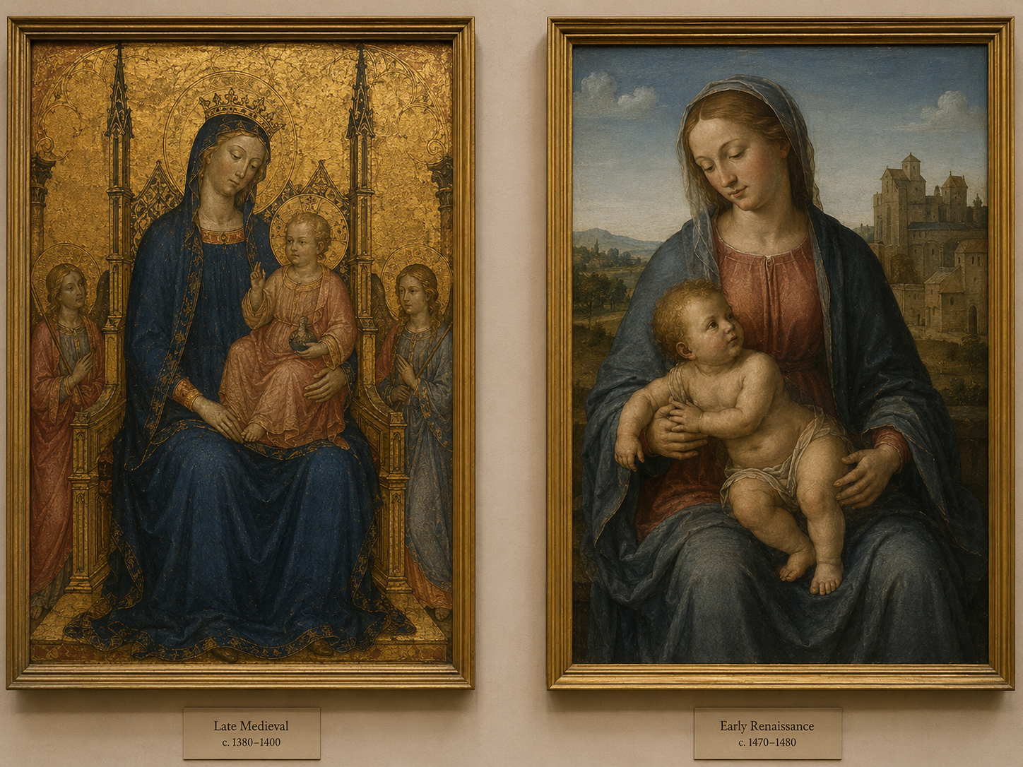
This is where people often draw too simple a line.
Medieval art looks strange.
Renaissance art looks realistic.
Therefore, medieval artists were bad and Renaissance artists finally learned how to paint.
The real story is much more interesting.
Renaissance artists inherited older traditions while also looking closely at the natural world, ancient art and the human body. They became increasingly interested in believable space, proportion, anatomy and light.
Perspective became a powerful tool.
Figures could be placed inside convincing spaces.
Bodies could be given weight.
Faces could have more individual character.
By the 15th century, artists in Northern Europe were also achieving extraordinary naturalistic effects. The Metropolitan Museum describes Early Netherlandish painters as developing highly detailed ways of showing landscapes, objects, portraits and everyday life.
But even that should not be turned into a simple story of “symbolism disappeared and realism arrived.”
Symbolism never disappeared.
And medieval art was never only symbolic.
There were already medieval artists interested in nature, movement, detail and convincing forms.
What changed was the balance.
A painting could increasingly ask:
What would this person really look like?
Where exactly are they standing?
How does light fall across the room?
Those questions became central to a new kind of naturalism.
So perhaps the strangest thing about medieval paintings is not that they look different from ours.
It is that we often assume they were supposed to look like ours in the first place.
They had their own visual rules.
Once you learn those rules, the faces become less strange.
The paintings start to make sense.
And some of them become much more impressive.
Why Renaissance Art Feels More Real
So, Were Medieval Paintings Really “Bad”?
Not really.
They can look strange to us because we are judging them by a rule they were not always trying to follow.
We expect a picture to show the physical world as closely as possible.
A medieval artist could have another priority.
Who is this?
What is happening?
Who is important?
What should the viewer remember?
What should the viewer feel?
That is why a face could be stylized while a robe was painted with remarkable care.
Why a ruler could be made larger than his attendants.
Why a holy figure could appear against a gold background instead of inside an ordinary room.
And why, centuries later, artists could move toward a much more natural-looking style without the earlier art suddenly becoming worthless.
The strange face was not always a mistake.
Sometimes it was the answer to a different question.
Not “Does this person look real?”
But:
“Does this picture tell you what you need to know?”
That is a very different way of looking at art.
And once you try it, medieval paintings stop looking quite so strange.
Frequently Asked Questions
1. Why do medieval paintings look so strange?
Many medieval artists used visual conventions that valued clear identity, religious meaning and storytelling over realistic appearance. But medieval art covered many centuries and regions, so not all medieval paintings look alike.
2. Were medieval artists bad at drawing?
No. Surviving manuscripts and artworks show that medieval artists could produce extremely detailed work. Some artists carefully painted faces, clothing, landscapes, objects and tiny decorative details.
3. Why are people in medieval paintings so stiff?
Clear, deliberate poses could make figures and actions easier to understand. At the same time, medieval artists also developed increasingly natural ways of showing movement and the human body, especially in later Gothic art.
4. Why are some people much bigger than others in medieval paintings?
In some works, artists used hieratic scale, showing important figures larger than less important ones. The difference in size was about importance rather than actual height.
5. Why do medieval religious paintings have gold backgrounds?
Gold could create a setting different from an ordinary physical room or landscape. In Byzantine religious art, gold grounds were closely connected with the presentation of sacred images.
6. Did medieval artists care about realism?
Some did, and the amount of naturalism changed over time. Medieval artists could carefully observe and paint people, objects, clothing and landscapes while still using stylized conventions for particular purposes.
7. When did medieval art become more realistic?
Naturalism developed gradually, with important changes during the Gothic period and later medieval centuries. Artists increasingly explored natural bodies, movement and drapery, but the change was not the same everywhere.
8. Why does Renaissance art look more realistic than medieval art?
Renaissance artists placed increasing importance on believable space, proportion, anatomy, light and observation. These changes built on earlier traditions rather than appearing from nowhere. Early Netherlandish painters, for example, developed extremely detailed naturalistic techniques in the 15th century.
9. Did medieval paintings always use symbolism instead of realism?
No. That is too simple. Medieval artists used both symbolic conventions and naturalistic details, depending on the period, region, subject and purpose of the artwork.
10. What should I look for when viewing a medieval painting?
Instead of asking only whether it looks realistic, look at what the artist wants you to notice. Check the size of the figures, their clothing, gestures, objects, background and facial details. Those choices can tell you who matters, what is happening and how the image was meant to be understood.